
STEP 1:Take a photo out in the world that inspires you through color

STEP 2:Open up the photo in Photoshop and zoom in until you see the pixels of color present themselves

STEP 3:Take the eyedropper tool and start selecting colors from the pixels that you like

STEP 4: Final Colors
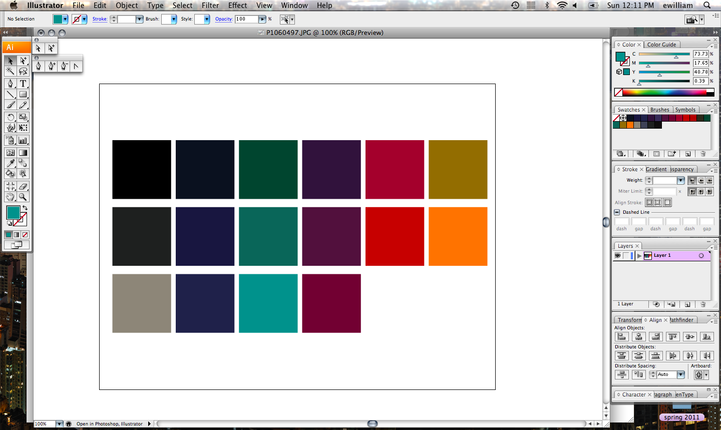
It's as simple as that! And because you are pulling from the same photo, the tone of the colors should all sit together. No need to spend hours plucking color chips from a Pantone book and making sure they all work with each other. I love this technique and am grateful to all my mentors and teachers for showing me such tricks of the trade.
Cheers!
No comments:
Post a Comment